
Friday, December 18, 2009
Monday, December 7, 2009


Saturday, December 5, 2009


Thursday, October 22, 2009
Warshing machine
My elderly studio project has slowly changed and been specified to become a clothes washing/drying machine. Emphasis on removing steps and making the remaining ones more easy. I'm doing this by having an all-in-one clothes basket.
[picture goes here]
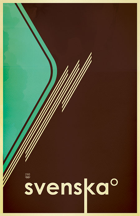
I think I can squeeze my sparrow motif in somehow.
[picture goes here]
I think I can squeeze my sparrow motif in somehow.
Tuesday, October 6, 2009
UP wallpaper
In honor of my homeland and it's watery features, here's a wallpaper I made last night. Sorry for the poor web quality.
(1440x900)

(1440x900)

Tuesday, September 22, 2009
Empty nesters
So a month and a half later, I'm back at CCS wracking my brain over designing for the elderly/baby boomers. I've had small Eureka moment. Involving birds, sparrows actually. But in only a general theme. I have yet to really focus on a market or problem or issue yet. But after watching and studying sparrows around campus, I got the idea of the empty nest. Their kids are starting to move out and away from home leaving them still with the need to care for something.

See? Birds, nest! Let's see where I can take this in the more practical way.

See? Birds, nest! Let's see where I can take this in the more practical way.
Monday, August 3, 2009
'un'
I was zoning out today, staring at my bottle of Sunkist orange pop, when I noticed this cool detail. The 'un' is made into one letter form. Same goes for the last iteration of their logo too.

Monday, July 27, 2009
11 Days left...
I have four bags and each one is about 75% done or more. Working on tech packs and sketches. Final renderings are... lacking. It's all going to go in a book for final presentation, probably a big ole poster to accompany. The earlier "Street Fighter" became less aggressive and more delinquent. Themed around graffitiists and with nothing better to do than tag trains and alleys. It's mostly empty of graphics for the owner to tag his own gear.

Sunday, July 26, 2009


Friday, July 24, 2009
Monday, July 20, 2009
Thursday, July 16, 2009


Wednesday, July 15, 2009
I shoed a little bit
I got distracted and sketch a men's formal shoe. I love Sketchbook Pro and would like to try the 2009 edition. I heard good things about it, especially the $100 price tag.

Monday, July 13, 2009
Votes yes on Prop C
The third proposal is following a "street fighter" theme. For the young lad who's out on the street, up to know good. It's following the look of WWII motorcylces, utiliatiran, rugged. Asymmetry to follow the gas tank. It's a bit plain looking now, I know, but I just got on the Cintiq today. Look for more spangley bits, leather, fasteners, pockets.

Sunday, July 12, 2009
Phone charger base + writing my memoir
Yeah I'm writing my memoir. It's for a class ok, like my life is interesting enough to write a real memoir. But it's taking some serious time out of my bag project (which I've been meaning to post some images). It's the start of the second half, mid term was done last week already!
In unrelated news I found this:
taking a shampoo bottle and cutting bits off.
Thursday, July 9, 2009
Shoes in disguise
Transformers shoes?! Yeah. They look pretty toyish and plasticy to me. Still, it's cool that someone actually green lit the idea at Nike. Packaging it neato too.


Wednesday, July 1, 2009
I wish I could illustrate
I'm always impressed when I walk the Illustration floor here at CCS. Even more so than looking at shiny digital models or Photoshop renderings in the ID department.
Tuesday, June 30, 2009
Construction barrel
Ah, summer time. When trees rustle in warm breezes, birds fill the early morning silence with their song and bright orange and white barrels bloom all over roads and highways. It's a common sight in the city and with such a striking color palette, a fun first for my bags.
In inspiration news, I discovered who the designer of this print was; Scott Hansen. I found it some time ago. I love his use of color in all of his work. He also has his own music playing in his portfolio. Definitely and inspirational dude.
Monday, June 29, 2009
Lining up
My design statement is coming closer to a finish. This whole project has been morphing from the start, changing slightly every day. The project as of today; taking a number of inspiring urban themes and create a bag from each one. Some examples:


Sunday, June 28, 2009

Tuesday, June 23, 2009

Monday, June 22, 2009
Getting momentum
So rather than find a material that's out there, I'm going to choose one that I want allowing for a new material. There are things made from sails, truck covers, leather scraps. What am I going to use? It depends on who I'm designing for.
I'm going to try and do a yin and yang thing using the two sides of a city. Crumbling brick and mortar with shiny steel. Glass shards and mirrored windows. Urban decay vs sleek and modern.
What do we think? Too played out already? I'm looking to have either two bags for one person or one bag with "split personalities." Think the GM Renaissance Center vs the abandoned Detroit train depot.
In other news, my friend Geof turned me on to this Behance art and design portfolio thing.
Check this guy out: Make Something Cool Everyday. Very inspiring.
Saturday, June 20, 2009
Done before...

Not surprising, I've been finding a few companies that do what I want to do: Seabags and Freitag take old sails and semi-trailer tarps and make trendy bags from it.
One idea I have is to take the old banner signs from past events. Usually I see some pretty tacky ones on bars and gas stations (in the UP at least) that are beer ads welcoming motorcyclists or snowmobilers. Or also using the nylon webbing/straps for towing.
I'm still looking tho, something not so... trashy.
Tuesday, June 16, 2009
Studio, summer '09
What am I doing!? Well it's an open studio which means I can do pretty much whatever I want to. I'm going to pick up that bag project from Florence and actually do it. So more style than problem solving. I don't have enough of that in my portfolio anyway. Also I want to use recycled/reused materials from industries. Something that's readily available and in large quantities. I'm still looking for my big inspiration. Let's hope my contact from Nike will still talk to me...
Saturday, June 13, 2009
AutoX

First race of my season and I beat an older M3 and a Mitsubishi 3000GT VR-4. Geof raced his 2 week old WRX and got me hooked on forced induction.
Monday, May 11, 2009


Thursday, May 7, 2009
On the LdM website, woo
A cropped version of my poster is on the LdM website. They work fast, I turned it in on Tuesday and it was up the next day. Let's hope we see it around town soon.

Thursday, April 30, 2009
I won the contest
Yay! They only need my poster because there is a compilation of exhibits going on. I guess it's going to be in a book and also posted around campus. Unfortunately, the display on my laptop had an anurism and I had to send it in. I won't get it back for a week or so and they might need my original file...
Thursday, April 23, 2009
Final(ish) Pieces
Here's my mostly finished poster, A1 (594mm x 841mm). The typeface is Clearface Gothic LT Std, 95 black and 55 roman. I'm not too sure on the subheads tho. My body copy on supporting piece is a safe Garamond and I felt I should include it in the poster too. It was too hard to read so I went back to the roman Clearface. I'm also happy to say the photography is original and mine.


Monday, April 20, 2009
Class project again.
Changed font, and color and added the core to my bucket. I'm still unsure as to which color exactly tho. The text should have been a 100% black but it got knocked down a bit while web prepping it.

One idea I have is to incorporate the color in to the shoes. It may look a little too heavy afterwards, we'll see what happens.
Class project (redux)


I made some web-safe JPGs and it turned out like they should. I would like some input for my internet audience. Color, text, arrangement? The orange one is neat because it grabs the color off the bus but there's not enough contrast. I also should make the paint runs more organic and fitting to the cracks. I need some help with the yellow text placement.
Also, here's a Typeface sampler from the beginning. See anything better than my choices or a typeface you think I should experiment with?

(EDIT: it appears that only one image can be viewed fullsized. At least the color is proper.)
Sunday, April 19, 2009
Class project
 We've finally have a real assignment for my graphic class. There is a small exhibition for the art students at my school and we are to make the poster for it. The winner from my class will have it posted around the quarter. It's called "The Art is in the Streets." Not the best name really, but it's easy for a concept. I have two posters, one obviously had more time spent on it.
For some reason the color got all messed while uploading. I'm going see what I can do but in the meantime, just look at the concept I guess.

Tuesday, April 14, 2009
Hushpuppy project
Well I unfortunately didn't make the deadline for Reebok. However an opportunity was found on Core77 from Hushpuppy for an any-shoe contest HERE. The deadline for this one is June 30. The prize isn't a job, rather free shoes for a year, a £500 makeover for 5 finalist and the winner will get their shoe produced. I'm mostly looking forward to the makeover...
I'm going to take the same theme from the Reebok thing but not brand it as heavily. The theme, by the way, is a fashionable moped/moto boot. Rather than the sci-fi technical space boot or the heavy duty Harley Davidson style boot you can get, I'm going to have something that will look nice at work and on a moto. Note the Italian influence since 90% of the motor vehicles in Florence is a moped.
Wednesday, April 8, 2009
Three day Reebok project
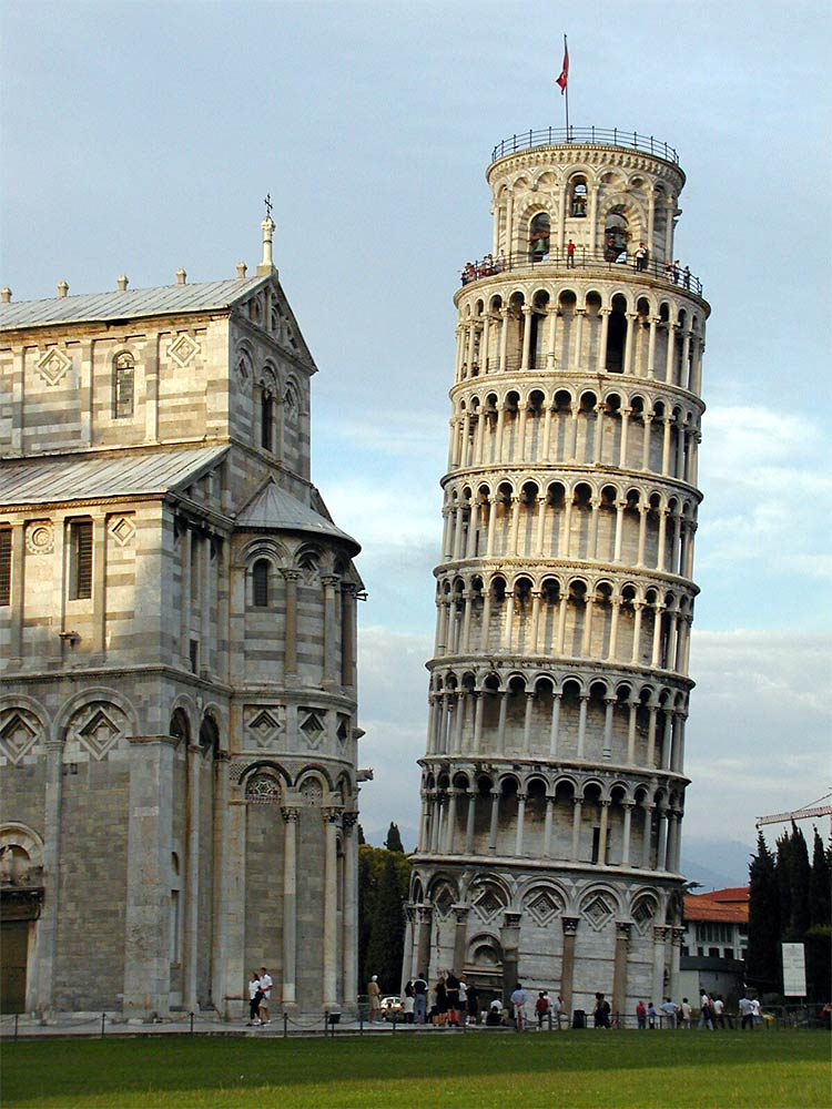
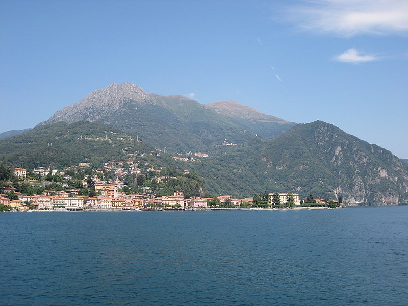
So I've been neglecting my Blog for a whole month. Spring break happened in March. That may possibly be the best spring break I've had. I took a small tour of Italy via Pisa, Cinque Terre, Lago di Como, Milano, Torino and my family's sleepy little town of San Giorgio Canavese.

But soon after I got back to applying for internships. I managed to apply to Reebok earlier this week and I got a response of "here's a project, due Arpil 10." I read that there was some application project but I didn't know what it was about really. I guess I have three days to design a shoe, or sporting apparel, or some graphic tees/pattern depending on what area I'd like to go in to. I'm looking at the shoe or apparel. They both have to use Reeboks philosophy in a sports or sports inspired project. The toughest part is who Reebok is.
I know I'm going to focus on something for Italy or Italian related since I'm here. Looks like my unfocused bag and logo project have been put on hold. Same goes for anything else really.
Monday, March 9, 2009
Independent independent study
Because I'm not taking an ID studio this semester, I'm feeling a little withdrawal and need to design more. One idea I'm doodling for is a standard messenger bag, inspired by a recent purchase and seeing these things every where. Another is a graphic exercise to create a logo. I have a slight proposal/description so far but it needs a lot of guidance, opinions, input...

Florence was the center of the Renaissance period. Much of the art was commissioned by wealthy middle class workers and businessmen. These workers made up various guilds for the various industries around the area; wool, silk, gold, banking, etc. Each guild had their own crest to represent them and many are still up on buildings around the city.
Another famous art movement originating in Italy was Futurism. At the beginning of the 1900s, artist were frustrated with having Italy being known only for it's classic art rather than the contemporary. They wanted to look ahead in art and make their own mark on the art community.
Currently, Florence, and most of Italy, has a balance of being historically rich and stylistically forward. What I'd like to do is create a guild-style crest that can fit in contemporary Italy.
One example I found is the logo for the Fiorentina football club. They use classic colors of purple and red with touches of gold. Historically, Florence was
known for its vivid purple dyes, and the gold for it's wealth. The Florentine giglio (an Italian version of a fleur di'lis) is streamlined to be more modern.
This is where you, my internet audience comes in. I'm not trying to copy this example. This is a logo for a football club and I need to make mine for a different target. I'm not just open to ideas but I'm asking for them. Grazie!
Wednesday, February 25, 2009
Mardi Gras riot

Last night during the final hours of Carnivale, we heard what sounded like a mobile club making its way down our street on Via dei Neri. There was a truck with beer, music, and some man on a speaker shouting things. I assumed it was just some carnival parade until I saw a number of people in these masks gluing things to walls. At first I thought it was a Bloody Beetroots fan club.
After they had left, it looked like propaganda. I visited the website and had it translated by Google. It seems like it's an antigovernment/proanarchy organization that, ironically, is against organizations. They do have a neat little mascot called Babau the
monster, however.


Subscribe to:
Posts (Atom)
